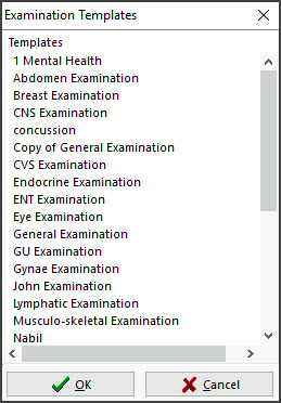
Examination Templates provide a quick method of entering patient examination details into encounter notes. There are templates for 14 different clinical examinations, and you can also create your own.
Using an Examination template
The selections you make in the Examination Template are entered into the encounter notes when you select OK. This means a well-structured and comprehensive set of information is entered for the examination.
To use an examination template:
- Start an encounter with the patient.
For a detailed explanation of how to do this, see the Start an encounter article.
When the encounter starts, the Current Encounter pane will open and display the clinical modules. - Select Templates from the Current Encounter menu.

- Select the template from the list.
- Make your selections in the Examination Template to record the information.
- Select OK to save and exit.
The information will be saved to the Current Encounter notes and added to the History View when the encounter is closed.
Below are an ENT Examination template's questions and what the information looks like when you add it to the Current Encounter notes.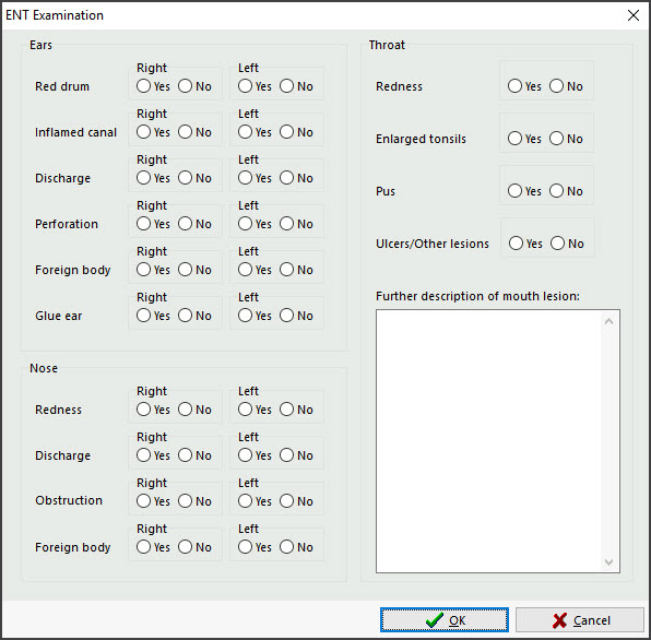


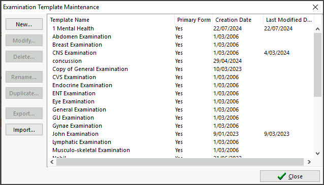
Examination Template editor
The template editor allows you to modify, copy or delete Examination Templates and create new templates.
To open the editor:
- Open Clinical.
- Select the Tools menu.
- Select Clinical Setup > Examination Template Editor.
You can:
- Use New to create a new template
- Use Edit to modify the selected template.
- Use Duplicate to copy the selected template. The new template will be called "Copy of <original name>". This option is an easy way to make a new template, as you can remove and rename existing questions and fields.

Making a new template
To create a new template:
- Select the New button.
- Type the name of the new template into the field provided.
- If this form is to be displayed as a selectable template during a consultation, select the Primary Form check box.
- If this template is to be called from another template via a button link click and is not a primary form, unselect the Primary Form checkbox.
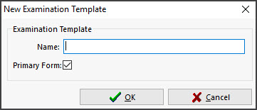
- Select OK.
The Examination Template Designer will open.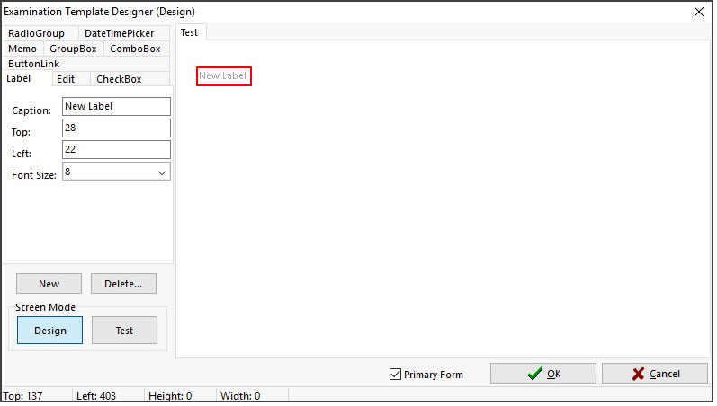


Create, modify and delete Controls
To create a new control, select the tab of the desired control. Click the New button. The New button will grey out. Move the cursor over the Template Design Area. Position the mouse where you want the top, left coordinates of the control to appear and right-click and hold down the right mouse button. Now drag the mouse down and to the right. A red outline will be drawn. This shows the size of the control. Once the desired size is selected, release the right mouse button. You may now enter in other details for the control in the Control Tabs area. When completed, left-click anywhere within the Template Design Area except on the control you just created. The control creation will then be complete.
To modify a control, left-click on it once. The control will have a red outline drawn around it to show that it has been selected. The Control Tabs will select the tab of the control selected and populate the values of that control into the fields. The control can be modified by changing the values or by clicking on the control again and moving it or resizing it with the mouse.
Select the control by left-clicking on it once. Once the red outline is drawn around it, click on the Delete button. A confirmation message will appear asking are you sure? Click “Yes” to delete the control.
Test and Design Mode
To test the screen, click on the Test button within the Screen Mode Group. The Test button will remain pressed, and the Examination Template Designer window heading will display the Designer's mode.
Test that the various controls look right and that any Combo Boxes have the correct entered items.
To return to Design mode, select the Design button. The Test button will come up and the Design button will stay pressed. The screen heading will also reflect the mode.
Tab Order
Each control that has a Tab Order property should ideally have this field entered. They should be numbered from 0 (zero) and incrementing by units of 1 (one) for the next control. Normally the Top, Left control will be Tab Order 0 and the next one below it will be 1 and so forth. Only enter numeric values.
Saving Templates
Once all changes have been done, click on the OK button. This will save the Template. If you click Cancel, you will be prompted to save changes if changes have been made. It is recommended that on templates with many controls, to Close the template regularly so as to save all changes done and then reopen the template.
Controls Available
Label | The Label control is use to put static text on the screen. |
Caption: | The actual text to be displayed. |
Top: | The Top coordinate of this control. |
Left: | The Left coordinate of this control. |
Font Size: | The size of the font used with the Label control. Available font sizes are 10, 12, 14, 16, 18, 20, 22, 24, 26, 28 and 30 point. |
Edit | The Edit allows for one line of alphanumeric data to be entered on the screen. |
Top: | The Top coordinate of this control. |
Left: | The Left coordinate of this control. |
Width: | The Width of this control. |
Text: | Default text to be displayed. Normally, this will be left blank. |
Tab Order: | The order of the control will be selected when the Tab key is pressed. Also the order the contents of this control will be shown in the progress notes* |
Show in Progress Notes | If this checkbox is selected, the entered contents of this control will be output to the progress notes. If the caption is also entered, the caption will be displayed first, followed by the contents of the control. |
Memo | The Memo allows multiple lines for alphanumeric data to be entered on the screen. |
Top: | The Top coordinate of this control. |
Left: | The Height of this control. |
Width: | The Width of this control. |
Tab Order: | The order of the control will be selected when the Tab key is pressed. Also, the order of this control's contents will be shown in the progress notes.* |
Show in Progress Notes | If this checkbox is selected, the entered contents of this control will be output to the progress notes. If the caption is also entered, the caption will be displayed first, followed by the control's contents. |
Check Box | The Check Box control displays a label with a check box. If the check box is selected, it is True otherwise it is False. |
Caption: | The text to be displayed with this control. |
Top: | The Top coordinate of this control. |
Left: | The Left coordinate of this control. |
Width | The Width of this control. |
Checked | The default state of this control |
Tab Order | The order the control will be selected when the Tab key is pressed. Also the order the contents of this control will be shown in the progress notes*. |
Show in Progress Notes | If this checkbox is selected, the entered contents of this control will be output to the progress notes. If the caption is also entered, the caption will be displayed first, followed by the contents of the control. |
Radio Group | The Radio Group control allows radio buttons to be available on the screen. Only one radio button is to be able to be selected at one time. On entering the screen, all buttons will be unselected. Once a button has been selected, one must remain |
Top: | The Top coordinate of this control. |
Left: | The Left coordinate of this control. |
Height: | The Height of this control. |
Width: | The Width of this control. |
Columns: | The number of columns of buttons to be displayed. Available values are 1, 2, 3 and 4 |
Items: | Each line entered here, will be the name of the radio button. i.e. If you have three lines entered as Red, Blue and Green, you will therefore have three buttons labelled as Red, Blue and Green. |
Tab Order | The order the control will be selected when the Tab key is pressed. Also the order the contents of this control will be shown in the progress notes*. |
Show in Progress Notes | If this checkbox is selected, the entered contents of this control will be output to the progress notes. If the caption is also entered, the caption will be displayed first, followed by the contents of the control. |
Date Time Picker | The Date Time Picker allows a date to be entered on the screen. |
Top: | The Top coordinate of this control. |
Left: | The Height of this control. |
Width: | The Width of this control. |
Tab Order: | The order the control will be selected when the Tab key is pressed. Also the order the contents of this control will be shown in the progress notes* |
Show in Progress Notes | If this checkbox is selected, the entered contents of this control will be output to the progress notes. If the caption is also entered, the caption will be displayed first, followed by the contents of the control. |
Combo Box | The Combo Box control allows a drop down list containing various pre-defined values to be selectable on screen. When this control is shown on screen, it will default to blank (nothing) selected. |
Top: | The Top coordinate of this control. |
Left: | The Height of this control. |
Width: | The Width of this control. |
Items: | Each line entered here will be a separate item in the drop down list. |
Tab Order: | The order the control will be selected when the Tab key is pressed. Also the order the contents of this control will be shown in the progress notes* |
Show in Progress Notes | If this checkbox is selected, the entered contents of this control will be output to the progress notes. If the caption is also entered, the caption will be displayed first, followed by the contents of the control. |
Group Box | The Group Box is a box outline with a caption. It is used to logically group items together on t |
Caption: | The Caption to be displayed with this control. |
Top: | The Top coordinate of this control. |
Left: | The Left coordinate of this control. |
Height: | The Height of this control. |
Width: | The Width of this control. |
Button Link | The Button Link is used to place buttons on the screen. These buttons launch other defined templates, including Primary templates. |
Caption: | The Caption to be displayed with this control. |
Top: | The Top coordinate of this control. |
Left: | The Left coordinate of this control. |
Width: | The Width of this control. |
Tab Order: | The order the control will be selected when the Tab key is pressed. Also the order the contents of this control will be shown in the progress notes. |
Link: | This will list all available templates. The selected template will be the one launched when the button is pressed. |